Wednesday, December 17, 2014

Effects | Apple Destruction Simulation

 Death of an apple.
Here are a few images from a sequence my classmate and I have been working on for the last couple of weeks. We decided to try to shatter an apple for our final effects project. We used a mixture of multiple rigid body simulations in Bullet as well as Bifrost for the liquid. We used Vray to render. I'll have to admit, my classmate did an awesome job tackling most of the sim work. I helped on the rigids, doing dirty work here and there. I worked on the materials/shaders, and the models. We got some help from our professor on the wood and juice shaders, which definitely helped make our scene pop. For how much work we poured into this little project, I have to say some of the stills look pretty cool. We are going to work on a longer sim and more complex apple skin simulation to help give it a warping effect, so it looks less like pottery chips. I definitely learned a ton during this process, and I wanna try more effects projects soon.

My awesome classmate's blog


Thursday, December 11, 2014

Effects | Bullet Render Test

A quick test render of a 9mm hollowpoint bullet I'm working on for my effects class. It's been forever since I've rendered any real thing in Vray, but I think the texture is coming along.

Tuesday, December 2, 2014

GameJam | Amo

Some screenies.
Trailer 

Full gameplay walkthrough.

Amo Game
Controls
Spacebar starts the game.
Click on the colored triangle you want to place.
A and D rotate it.
Spacebar to place the triangle.
R to reset Amo if he gets stuck.

45 Degrees. That was the prompt my professor gave me and two classmates for a week-long GameJam project. We limited ourselves to one week of development, Sunday-to-Sunday. In exactly one week, we took our little concept and actually concocted a playable, interactive experience. We spent roughly 10 hours a day working on this project, so in a combined effort, that's about 210 hours between the three of us. We started out brainstorming what 45 degrees meant, whether it was temperature or angles..We decided on a strong triangular aesthetic that reinforced the idea of sharp angles. For a week's worth of work, I think Amo turned out to be a very good learning experience, as well as an interesting, even if rough, finished product. I hope you enjoy playing our game as much as I did making it!

My personal involvement on the project included a lot of the art direction. On day one I sat down and drew up some concept art for the character, the mood, the settings, etc. After that, the rest of the days became a blur of modeling, animating, and applying materials. We spent about 6 days on content creation. The last day was when everything took most of it's shape, as I spent a good couple hours set dressing the level and bringing Amo's little world to life. Animating Amo was fun, but I am fairly proud of Nyx's hand. Also, this was the first project I've ever animated two characters in a single scene, which was new, but also quite challenging and fun.
Interestingly enough, even though we had such a short amount of time for development, we still wanted to include a strong narrative, even if it was simple. I worked with my fellow classmates to develop a story in which Amo, our hero, is guided by Nyx, the Goddess of Sleep, on his adventure to become the hero he admires. Nyx helps Amo by placing triangles in his path to help him overcome obstacles. We set up special 'hero' locations that included a shop, a giant tree, and a shrine, where he obtained the armour he needs in order to become that hero. We also didn't want the game to include violence, so if Amo fails in his quest, he gets another try.

I could go on and on about how much I learned from this project, which was a ton. I could also talk about all the problems we experienced and how if we had had more time, this and that could have been fixed/added. But I'm truly happy I spent my school break building something unique, hopefully fun, engaging, and artistically driven with friends who I've gotten much closer to over the last couple of days. I'd love if it you could try the game out, leave some feedback on all of our hard work! 
Here's the download link again in case you missed it above!
Amo Game

Wednesday, November 26, 2014

GameJam | Amo | Concept Art Sketches

Two classmates and I are in the middle of a weeklong GameJam over Thanksgiving break. I'm supposed to be doing the concept art, and almost anything related to the art. Our theme for the jam was '45 Degrees' so we are rolling with a very triangular design. I can't say a lot about the project yet, but so far is coming along pretty nicely. I hope you guys enjoy the style!


Saturday, November 22, 2014

11.22.14 | Weekend Sketches

Here are some sketches I drew this week. I haven't drawn anything traditional in a long while. I really wish I could draw. I think I'm getting the basic nature down, but my lines are too tight and so my drawing suffers. Ugh. More practice, but these were fun and relaxing to do. Why is line weight so hard for me?

Sunday, November 2, 2014

SOL | Artifact Concept Art


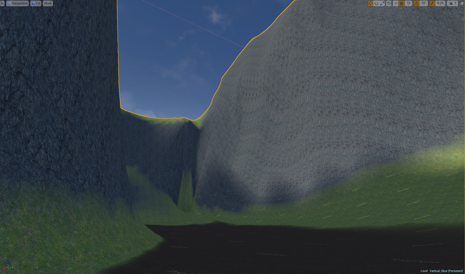
Here's another painting I've done for SOL. We took screenshots of our basic level layout, and then painted over them to show how that basic terrain could be built up. I chose to do an artifact site, where you can collect the antigravity ability for your gun. I wanted to put that artifact under floating rocks, as an indicator of what it might possibly be used for. I also put some lumen ore glowy bits on the floating rocks and on the cliff walls, as this might have been an area for good mining. This was fun to paint, I usually avoid color to work on value, but who knew colors could be so much fun? Let's hope this can quickly translate to our Unreal level!

To give you an idea of where this image started..

Before
After


Saturday, November 1, 2014

Subject 8 | Modeling Progress 1

Watch in HD!


This is a character design I created last semester at school in 2D. One of my goals for this semester was to get Subject 8 made in CG, so I could either animate a short piece or put him into Unreal Engine 4. This is my current progress on his design in 3d. I worked on his basic mesh over the summer and I finally started sculpting him out last week. I don't have a strong understanding of anatomy yet (I'm using reference of course!) or shape design/language, but I think he's finally getting to a point where the design is starting to show through the form. I still have to finish his legs, hands, and feet as well as add some more hard surface structures and hoses. He's coming along though! I can't wait to move on to the look phase, where I'll texture and create materials so I can get some proper renders out.

Wednesday, October 29, 2014

Sol | Storyboards | Crash Scene Pass 1

Here are the storyboards I drew for the animatic I posted a few days ago. I figured I'd put up the stills, because there's something valuable in evaluating them on their own. Compared to my previous boards, these are a definite big improvement. Still, I feel like I could improve on overall direction and incorporating more dramatic cameras and interesting story points. These are arranged slightly out of order, but the general gist is there.The correct order is in the animatic. Hope you enjoy these! I think my favorite panel is the one where the squid is looking up after not being crushed by the spaceship like "Huh?! I'm still alive?!"

Tuesday, October 28, 2014

No Shave This! | First XGen Hair Render

In Effects Class we are learning XGen, which is a plugin for Maya that you can use to build hair, grass, fur and other large amounts of detailed objects. For our first assignment with XGen, we had to build a hairstyle for the Malcolm rig and then make it dynamic. Of course, in the spirite of the impending No Shave November, I built a beard (neard, really!) instead of a hairstyle. This is a render I did in Vray 3 using a default gray hair shader and skin shader.

Wednesday, October 22, 2014

Sol | Concept Sketches


This is some concept art I sketched out today for SOL. Actually starting to really get into this digital painting thing, I'm always scared to work with color, but I think these things are starting to look okay. Really diggin' the floating rocks powered by energetic ore veins/chunks. Gonna be pretty awesome. Excite!

Monday, October 20, 2014

Sol | Crash Scene Animatic v001

This is an animatic I'm working on for our junior class co-lab game project, Sol. Our hero, Spero, flies into Musa's atmosphere only to get zapped by an alien weapon. When his engine fails he crash lands, narrowly avoids missing a bewildered and slightly terrified alien squid. Haven't done storyboarding since last year but I think these are a step up from what I've done previously. This is only one segment of a more complete sequence but it's coming along. Still plenty of room for improvement but communicating a story visually is a challenge and super fun for me. Hope you enjoy it!

Sunday, October 19, 2014

giraffe.sketch

My friend wanted to me to draw a giraffe. I've never drawn a giraffe before, but I ended up with this guy. The sketch went through a ton of iterations before it got to this, even then some of it is pretty awful, haha. But I think it turned out okay and my friend was amused, so that was pretty fun.

Thursday, October 16, 2014

Drawjam 10.16.14


So I haven't drawn anything in a really, really long time, at least nothing that I've put on my blog. The first image I referenced another image from one of my favorite artists, I don't take credit for the design but I was trying to match his line style, which is full of life and weight. The second guy is one I drew from a photo reference, all original there. I really suck at drawing mouths and this one actually turned out okay.

Tuesday, October 7, 2014

Rigid Body Simulation | Instanced Particles

I pumped out a quick render of my window shatter scene. Since the last version I posted, I also built a particle system to add in more pieces of glass with smaller bits and more detail. It really helps fill in the scene. I need to build more particles systems and learn more about them. I also rendered with some motion blur and depth of field to help push the perspective. 

Sunday, October 5, 2014

Perspective Marker Sketch

Just a quick sketch I did with some of my new Micron markers. I've never used markers before, and it's a challenge since there's no erasing, but I definitely am in love with fluidity of the lines and the expressive weight one can get from them. Another thing I suck at is perspective, so I tried throwing down a grid and building up something from that. Fenceposts receding always seem to work for some reason.

Saturday, September 27, 2014

Soundscape | Unearth

This is a little unusual compared to most things I post. I'm taking a Sound Design class this semester and one of our first big projects was to make a soundscape. I am even more intrigued by sound design than I was before, especially since this is my first foray into the audio world. The idea I pitched was to have an explorer walking down a cave or tunnel and then waking up an ancient mechanical being. I thought I was being a little too ambitious considering my lack of knowledge and class load, but I wanted to try to do something that was organic, mechanical, and ethereal. I'm actually pretty happy with out this turned out for a first attempt at sound design.

I recorded everything you heard by hand using a field recorder and a studio mic for the singing portion. I even played bongo drums for the background beat. Then I mixed it all together in Pro Tools 11 (audio editing software). Recording some of the natural stuff was fairly straight forward, like dropping rocks in a tunnel, or recording a bubbly stream. But the robot noises were a little more difficult. I recorded things like a little r/c quadcopter, an Xbox360 disc drive opening and closing, aerosol cans for hissing noises, and screwdrivers scraping along metal. For the main transition noise before the robot shows up I recorded my fingernail running along a guitar string. I also capture the noise of a heavy metal washer spinning down onto the top of a bongo drum. When I went out into the woods, I found a dead log and thick dead stick. I hit the stick on the log and I ended up using those noises to help fill in the drum beats and make them more organic. So I just recorded a bunch of cool sounding noises, then patched them together in the mix.

I hope you enjoyed listening to it as much as I had fun making it!

My friend Seth Weedin made the visualizer for me, you can check out the work soundscape and music he makes on his Soundcloud: soundcloud.com/breaklinemusic

Friday, September 12, 2014

Rigid Bodies Simulation | Shattering Window v001

This is my first attempt at a rigid body destruction simulation with Bullet in Maya 2015. I wanted to simulate a window shatter from a shop's storefront. I had an overly ambitious idea, but I scaled it back to just make a coatrack fall through the window, shattering the window and eventually breaking a wooden crate underneath it. This is a playblast of where I'm at so far. It's gonna be really fun to render this out. There are some glitches and weird twitchyness going on that I have to figure out, but I'm happy with how this is turning out so far. It's really fun to watch things get destroyed!

Wednesday, September 3, 2014

Sol Concept Art | Mountaintop Village

Here is a piece of concept art I painted for our Junior Collab project, Sol. I spent a lot of time on it, and for my second piece of concept art ever, I think it turned out okay. It's a tribal mountain village built next to a door in a mysterious cave, which turns out to be the door to a buried mothership. I spent too much time fiddling with brushes and figuring out how to get good clean edges, but in the end I learned a lot. I still suck at drawing in perspective, so it was a real struggle to show depth. I tried to concentrate on value and scale in order to push things back or bring things forward. I definitely enjoyed turning on music and painting for hours. I will get faster. Just needed to move, so I didn't include all the details I could have.

Monday, August 18, 2014

Modeling Monday #5 | 8.18.14 | Subject 8 Progress

So I'm kind of copping out on this Modeling Monday. I did a lot of work on Subject 8 on Sunday so it really wasn't work today, but oh well. Anyways I present you with a new render update of his low poly base. I think his back shapes are coming along. Clearly his hands really haven't been messed with, still getting to that. Also need to do some work on his front. But he's actually coming together! Can't wait to get him sculpted and rigged!

Thursday, August 14, 2014

Face Sketches 8.14.14

I drew some of my friends in different styles for practice. Some of them turned out better than others. I need to keep practicing haha.

Monday, August 11, 2014

Modeling Monday #4 | 8.11.14 | Subject 5 Viking Wastelander

So this was what I eventually ended up modeling today. Took me awhile to figure out the main helmet shape, for some reason I was really struggling with that. In a big change from my previous Modeling Mondays, I want to do something with pushed proportions and more stylized than my previous realistic models. I was also trying for a simpler, low-poly look that was more shaped based. I quickly modeled up a neck to fit into the mask, I know it's still pretty chunky. I kinda like the faceted look though. There's a major seam I have to smooth in the middle. I might try to actually handpaint a texture for this guy sometime in the near the future. It wasn't intentional, but I think I'm adding him to my 'Wastelandia' set of characters as Subject 5. Think crazy, neurotic wasteland TF2 Scout. I might keep working on this though, it has potential.

Saturday, August 9, 2014

Sketchbook Saturday #3 | 8.9.14 | WW2 Machines

Here are some sketches I did this week. I've been mostly drawing WWII era machines and characters, because I'm so caught up in dieselpunk and that's what I want to draw. So I need to expand my shape language and learn how these things are built. A couple of traditional sketches as well as a digital one. More will be sketches for next week. I've had a crazy two weeks, so I should be back on track now that I'm at school.

Friday, August 8, 2014

Speedsketch | 1 Hour "Jaegerfist" bandit

Here's a speedsketch I did during a challenge with one of my classmates. The theme was "Jaegerfist" or "Hunterfist". So we had to draw whatever that kind of fist would be. Of course, I steered toward a dieselpunk inspired arm cannon. From the start I knew the cannon was going to have a shark decal, since sharks were commonly painted on airplanes during WWII. Sharks are natural hunters. It made sense. I love his gangly body. He's a bandit out to get some loot. His hand is a bit broken but that's what happens when you have a time limit. I actually redid almost the entire sketch to clean it up and change his outfit. I made it much better and I'm glad I spent the time to do it.

SOL | Preliminary Sketches

Here are some sketches I did for our junior project game project "Sol". I'm not a concept artist by any stretch of the imagination, but someone had to start drawing some thumbnails so I took that mantle upon myself. Here are a few sketches I drew up for the overall feel of the game. They are only the beginning.

Monday, July 28, 2014

Speedpaint | 1 Hour Rocker Sketch

Rock n' roll to fill my soul! Another speedpaint, this one definitely took me longer than an hour, but I had the base construction done in an hour. I'm actually happy with out it turned out, for how long I spent on it. I'm slowly getting better. This was super fun to paint though, so rock on!

Speedpaint | 1 Hour Deerotaur sketch

Well, there's this. This time our challenge was to paint a fantasy hunter, either being hunted or hunting. I decided to go with a deerotaur. The story is supposed to be a knight brings the fight to the beast's den, where previous attempts have not gone quite according to plan. I like the skull detail on the antlers. I tried to focus mostly on composition and hopefully conveying a narrative. Yeah, the deerotaur doesn't really have hands. Oops. Also, this was longer than an hour. You don't want to see what I had at the hour mark. So I spent more time on it to make it a little better. Okay, a lot more time. Still, was fun to paint. Trying to get away from sketch lines.

Sunday, July 27, 2014

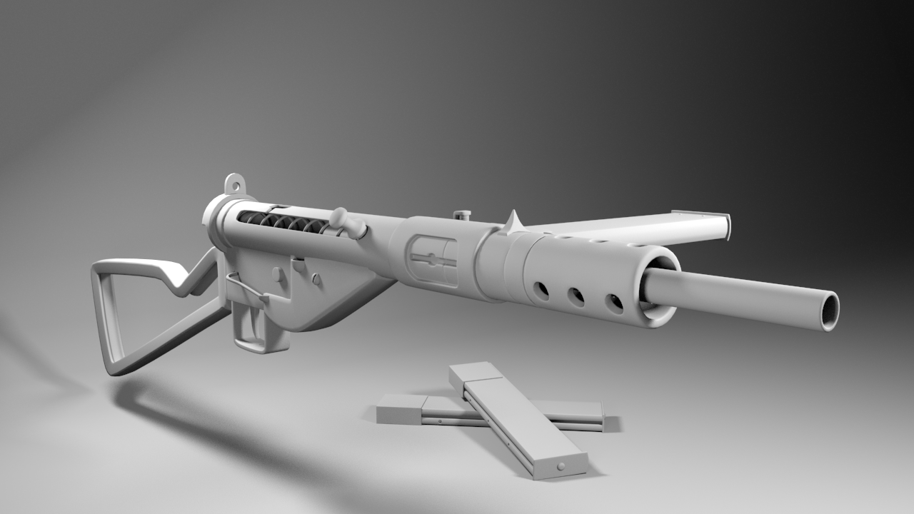
Modeling Monday #3 | 7.27.14 | Sten Gun Mk. II

A quick depth-of-field render to see what a possible in-game iron sights scenario would look like.

Yeah, I'm aware it's not Monday. And depending on how you look at it, I'm six days late, or one day early! I think I attempted something a little too complex for a single day's worth of work, at least, I'm not fast enough yet. Also, I had family emergencies to deal with this week, and family comes first, as much as I did want hammer away at this model. 

All that aside, this is my first weapon model. I think I pushed the tris too high, the 'lowpoly' version is around 17k tris (the two springs pushed this number up by 4k alone lol). I could soften the normals on it and that would help smooth it out. This is the smoothed version. So yeah, this took me a week to do, I'm not ashamed, I had a lot of fun and I learned a lot of new techniques, like how to make curves with triangles and how to make springs. I did make a major mistake though, in that I didn't model the middle fat piece of the barrel as a separate object. Which led to some inaccuracies where the shells get ejected and basically rendered it a nonworking model. However, the bolt slides back like it should, the magazine slides in and out, and the tigger rotates like it should! All in all, it was a ton of good practice for building an object out of a lot of smaller components, and I think the finished result looks decent. I might try to throw this into Unreal Engine and mess around with it in there. I don't know if I'll UV it and texture it yet, that would probably take about the same amount of time as modeling it. We'll see. I still plan on modeling something tomorrow, for Modeling Monday #4. It might be a little less ambitious haha.

Here are some quick work-in-progress renders where you can see how I started to build up the model:

And the final result.


I also updated my blog look. I got tired of the shadows and borders around the images, and you can only get rid of that in 'simple' mode. So I switched to a more traditional blog look. The color scheme fits me pretty well. Hope you enjoy the new look!